What are the best neutral paints for indoors?
“Designs are meant to be loved, not be understood”
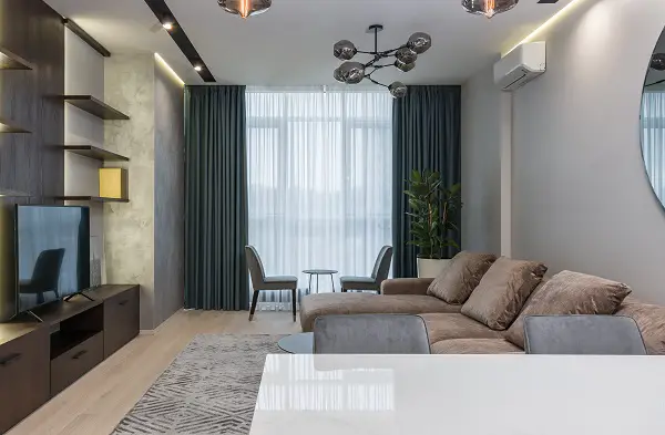
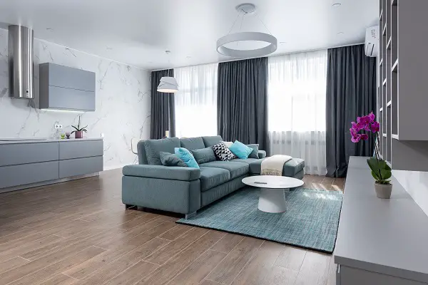
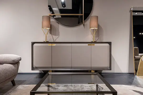
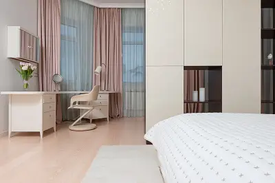
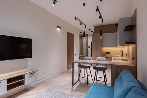
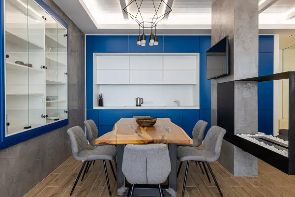
Interior matters a lot for its owner because it is a place where the most emphasis is laid. Everyone wants to keep it as elegant as they can. The most favorable atmosphere is that which is nicely painted. The color should complement the Interior like flooring, furniture, curtains, and other interior scheme.
Nowadays, instead of bright colors which were popular in ancient days, neutral colors have been taking the place of those colors like Fuschia pink, bright colors, etc.
- Neutral colors look more classy and modern.
- Classification of neutral colors for indoors
- Some researched discussion about the most popular choices for neutral colors that I adore are as follows
- White Dove
- White dove + lavender color
- White dove + the mint green color
- White dove +baby blue color
- White dove + ochre color
- White dove +pink color
- Mist Gray
- Greige ( beige and gray )
- Beige color for indoors
- Elegant Combination of Beige with White paint
- Combination of Beige with Almond
- Beige with olive-green
- Beige with Mauve Color
- Beige with maze yellow
- Repose gray
- How can you check on undertones like a pro?
- Experts’ Advice
Neutral colors look more classy and modern.
Moreover, it is a requirement these days, because due to overpopulation the landscape is becoming limited. Now people have small landscapes as compared to those in ancient times when people had their property on acres.
Neutral colors look pleasant, warm, calming, soothing, and make the congested space look wider.
That is the main reason behind the popularity of the new neutrals. Also, if you want some insights on modern decor, this article is for you for sure! Modern style decor guide
Classification of neutral colors for indoors
Neutral colors are muted colors that seem to lack color but often have underlying hues that change with varied lights. There are some examples of examples including beige, taupe, cream, brown, gray, black, and white.
While neutral colors are not on the color wheel, they complement secondary and primary shades.
You can incorporate primary colors—like white, red, and blue—to make a variety of other colors and the secondary colors are the products of mixing two primary colors, orange (yellow plus red), purple (red plus blue), and green (yellow plus blue).
Neutral colors can be complicated in tone, as mixing different colors produces rare shades.
For example, greige is a mix of light beige and gray, with yellow hues in natural light and gray in bright lighting. (Natural light indicates lighting produced from a natural source such as the sun.) You can make your greige color more life-like with these awesome faux flowers discussed in this article Why I am a fanatic for Faux roses and home decoration using them
Cool neutrals
Cool Neutral colors have purple, blue, ivory, taupe, and gray undertones.
Neutral colors perform as a chronic background for changing color trends these days. Cool neutrals colors are mentioned below ;
- Cool gray
- Icy gray
- Powder blue
- Light navy
- Light cool taupe
- Pewter
- Cool white
White is best as a cool neutral :
White can be a warm or a cool color counting on which tone of white you select. If you like your home to feel cool and relaxing, white is the best option for it
Cool colors contain green, purple, and blue Cool colors are usually relaxing and comforting but can also express distress. Purple is often used to help incite creativeness as it’s a combination of blue (calm) and red (intense).
If a company wishes to demonstrate the beauty, health, or security, incorporate cool colors.
Pastel colors and especially cool-toned pastels like baby blue, lilac, and mint have a comforting and softening effect. Neutrals like white, beige, and grey can also make you feel relaxed and calm.
Warm neutrals
Warm neutral paints contain orange, yellow, and pink undertones such as tan, beige, and gold.
- Warm beige
- Khaki
- Brown
- Camel
- Cream
- Ivory
- Taupe
- Stone
- Deep charcoal blue
Warm colors can arouse different sentiments than cool colors and bright colors can create different perceptions than muted colors. It all counts on how the psychological effects of color are being used.
Warm colors often arouse sentiments of prosperity, optimism, happiness, and vigor.
Though, yellow, red, and orange can also have an attention-grabbing impact and signal hazard or make you take action.
Some researched discussion about the most popular choices for neutral colors that I adore are as follows
White Dove
The white dove color is a warm tone color with a soft mulberry touch in it. A light neutral, icy, and soft color for the interior. It surprisingly reveals a light tint of gray color which prevents the only warm effects of this color.
The trim paint is very significant for the rest of the interior but if it does not complement the wall color which is in majority then it is not worth it.
The trim paint is paint that you apply to the door casing, window casings, ceiling edges, and other minor details of the interior to add elegance. It also goes well with other pastel colors like mauve, pink, mint green, peach, lavender, and baby blue.
The combination of dove white color with another postal color makes the indoor environment soft and peaceful.
All pastel colors provide the feeling of softness, sophisticated vibes, and calmness.
Amazing color combinations of a white dove with pastel colors
White dove + lavender color
(Lavender is an elegant shade as it is the color of a flower it symbolizes the sweetness and elegance of nature.
White dove + the mint green color
( the mint green has a refreshing and calming impact on mood .)
White dove +baby blue color
( blue is associated with stability if you want to concentrate on something, use this color combination in an area where you want to spend most of your time )
White dove + ochre color
(Ochre is a shade of brown that has an undertone of clay. It has warm feelings)
White dove +pink color
( a very beautiful and sugary combo, pink pastel with white dove color gives us the soft romantic and gentle vibes ).
You can add any color combo to your interior if you want to add some fun to your interior. These colors can be applied as wallpaper on one wall and you can leave the rest of the walls white dove color painted.
Mist Gray
Most gray is similar to classic gray with misty overtones of gray. It has scanty undertones of beige color. Most is generally a hue that is easy to embrace. It is imbued with the sentiments of courtesy, thoughtfulness, simplicity, contemplation, and ideas of renewal and ecology.
Mist gray color is neither gender-specific nor the color of any age group. It is a neutral color that is suitable for all age groups.
You can paint the room of your kids, grandparents, and even your bedroom with misty gray because it is a neutral color that compliments every kind of furniture. If you want to go with a more muted color, pair your grey with these white lilies and find some useful insights on how to do that, in this article. Reasons why I added Faux Lily Flowers in my home decor and places where I like to place them.
Misty Gray goes well decently to a dark furnished home.
Let’s suppose you have an interior scheme of dark furniture with bright fixtures, it will look great with misty gray.
Misty gray is a neutral and light shade that makes the indoor atmosphere feel relaxing and peaceful. Misty gray is the best option for small houses.
Greige ( beige and gray )
complete greige has an effect of beige and gray whereas only Beige has an effect of orange and beige undertones. Order a wall-stick sampling of Utterly Beige once to help you compare colors in your own space.
Greige is so jovial and points on what’s in front of it so you can add an explosion of tone, whether that’s through furnishings.
A chair, framed artwork, or indeed a pattern in a floor pillow that will stand out against that delicate, neutral background.
It rounds off a variety of architectural layouts, accents, and rooms, from a nursery to a living room. The simple regulation of layering greige with different neutrals adds depth to a room in a crafty way.
When utilized strategically, greige color can have a transformative effect on a space.
Add some accent pieces to your greige decor to enhance the aesthetic with this article Must have accent pieces.
Beige color for indoors
The dark Beige color is attributed to the color family of Pastel Orange. It’s of average brightness and a median undertone. Dark Beige matches the hex code#AC9362. The other (digital) color space RGB, it’s composed of 67 red, 58 green, and 38 blue elements.
beige is a versatile neutral that can work in any space, it can be used to warm up a space that is too white or cold. reversely it is a great neutral to keep strong pops of color from getting too crazy.
Elegant Combination of Beige with White paint
All-white-everything is traditional for a reason: it is delicate, neat, and easy to pull off. But, if you’re wishing to warm up your area just a slight, consider throwing in a few beige fixtures. The shade should make your space feel comfortable and more dynamic all without disrupting your minimalist paint strategy.
Combination of Beige with Almond
Beige is an extremely delicate color, but fill a room with it, and you might be amazed what a statement it can make. To keep things fascinating, add a little almond into the combination.
The color Almond is a little warmer and darker than beige, so it will add observable interest without bumbling your monochromatic palette.
complete greige has an effect of beige and gray whereas only Beige has an effect of orange and beige undertones. Order a wall-stick sampling of Utterly Beige once to help you compare colors in your own space.
Beige with burgundy ;
Burgundy is a strong color. But when paired with beige, it can look exceptionally loamy. This reinforces the color’s intensity just enough to make it easier to paint with, giving you a burgundy that feels delicate rather than striking.
Beige with olive-green
Beige and olive green give warm undertones, so they look extraordinary together. Beige soothes olive green while olive turns beige into a statement-maker. Since both colors are amazing, it’s easy to pair these shades with other colors, like icy shades that need a little zeal.
Beige with Mauve Color
Mauve isn’t the type of hue you notice every day, but the soft purple-gray can make a wonderful improvement to your indoors. When paired with a cozy neutral like beige, it can be perceived as both cozy and elegant.
Indeed, the beige-mauve color duo is unbelievable to feel as forceful as something involving a vivid glory tone, but since the mix is so commonly overlooked, it offers a subtle way to make a statement.
Beige with maze yellow
Maize yellow can be an exceptionally brilliant color. But, paired with beige, it gains a means of softness, creating it surprisingly simple to paint with. This is because both colors boast soft undertones.
Rather than constituting a high-contrast pairing, they form a congruent one. Beige serves as a cozy background for maize yellow, keeping up its own against the bold color. The result feels both intense and versatile.
Repose gray
Repose Gray is the perfect cozy gray neutral paint color for every room in your home. With subtle green and taupe undertones, it looks gray without ever sensing cold. If you’ve been looking for the excellent gray that never goes over coolness.
It is slightly closer to cozy gray than a true “greige” but is still that warm and cozy enough for me to consider it under that category.
The zeal gray has makes it ideal for any room in your home, be it a living space, bathroom, bedroom, or kitchen.
One of the shades that go adequately with it is the elegant gray-toned blue. Something about the gray-blue tone favors it so nicely!
Also with delicate white trim, Repose Gray gives a fresh unique touch to any room. Not merely is it a wonderful wall color, but Repose Gray is one of the favorite colors for kitchen cabinets.
Whether you prefer brass, black or silver hardware, gray will fit well with all of them.
Also, there’s no such thing as a true gray, sorry to burst your bubble!!!. Each gray has some kind of undertone – whether it is purple, brown, blue, or t, up. But some grays are nearer to a neutral, “true” gray than others.
How can you check on undertones like a pro?
The fastest way to specify the undertone is to compare it to a color that you know to be a true color in the same quantity tone.
- If you are aiming to find the undertone for a red, then compare it next to a true red. This will get you an idea of whether your red has a more yellow or violet undertone.
- It’s not always simple to find a true color for comparison, so use a color wheel to be sure you have the real pigment for comparison.
- Testing a paint color in your home is a promising strategy to check a color if you’re still not sure about what undertone you’re dealing with.
- Everything from base and counter surfaces to lighting outside can pull out surprising undertones on your painted walls.
Light bulbs can be cozy, cool, or natural, and can fix undertone problems instantly. Get some more insights about how to light up your home with this article 8 Stunning Tips to Light Up Your Bedroom In Style
Experts’ Advice
Indoors and outdoor are all important but indoors do hold more importance because that’s where you will spend more of your time. The colors play a significant role in affecting your mood and many other psychological effects. Neutral colors are very decent and a supreme choice for any interior. So, let’s choose the best color that vibes well with your mood and energy.